Hostwinds Tutorials
Search results for:
Table of Contents
How To Use Weebly Device Switcher
Tags: Weebly Website Builder
When building your Weebly site, you will want to make sure that it will look great on Mobile devices, which accounts for a large amount of the traffic on the internet today. Thankfully, In the Weebly Website Builder, a Device Switcher feature will allow you to preview and make sure your site is mobile-friendly.
It is important to note that the information provided in this guide is for informational purposes only. The premium features and changes made after the time writing this guide may be different and will be displayed to you in your Weebly account when editing your site through Weebly. Please open a ticket with our Support Team if you have any questions to help.
Where Is The Device Switcher Option?
The option to change how you see the page might be a little hidden, as it does not have a label next to it. Instead, it is simply an icon used to demonstrate the current device you are viewing the site from. By default, this will be in Desktop display mode and can be found by a Computer looking icon in the top menu bar inside the Weebly Editor.
Desktop View:

Mobile View:

Mobile View
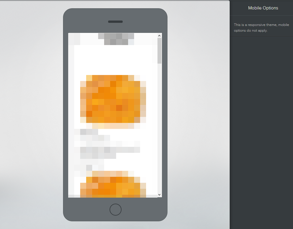
When in the Mobile view through the Weebly Site builder, you will notice that the visible view of the page shrinks to match a mobile-like view. There is also an outline, which represents the physical device from the screen. When in Mobile View, you will not be able to make changes to the site as you would with the Desktop View. The only way to make changes specifically to the Mobile version would be if the theme were non-responsive. By default, all new themes offered through Weebly will be responsive.

If you should have any questions or would like assistance, please contact us through Live Chat or by submitting a ticket with our Technical Support team.
Written by Hostwinds Team / August 15, 2018
